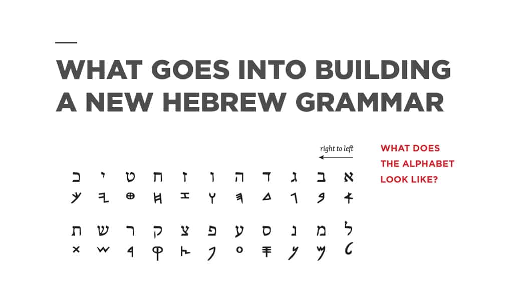
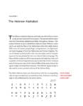
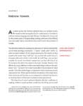
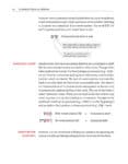
When we set out to create a new Hebrew grammar, the physical design of the book was extremely important to the final product. We wanted the book to feel approachable, clearly and cleanly conveying the complex information required to learn a new language. Here?s a quick look at some of the features we incorporated into Learning Biblical Hebrew. You’ll find a gallery of images below to give you a sense of what the book looks like.
- The first thing you might notice is the unique trim size. At 7″ x 9″, that little bit of extra width gives the text room to breathe on the page. The added margin also gives ample room for notes, something any student will appreciate.
- Opening up the book reveals a two-color interior. The red headers organize the text so that readers can easily follow along. Inline red highlights draw attention to the most important pieces of information on the page, allowing readers to easily grasp the concepts and details that might otherwise be missed.
- The text is laid out in an easy-to-read single column format. The Hebrew font is clean, clear, and sized for easy readability.
- With so much information to communicate, plenty of tables and diagrams are included to break up large text blocks. These tables are often full width, giving plenty of space for the material contained within.










This looks really good, guys.
Thanks, Spencer! If you’d like to review it on your blog, just let Lindsay Kennedy know.
Chris