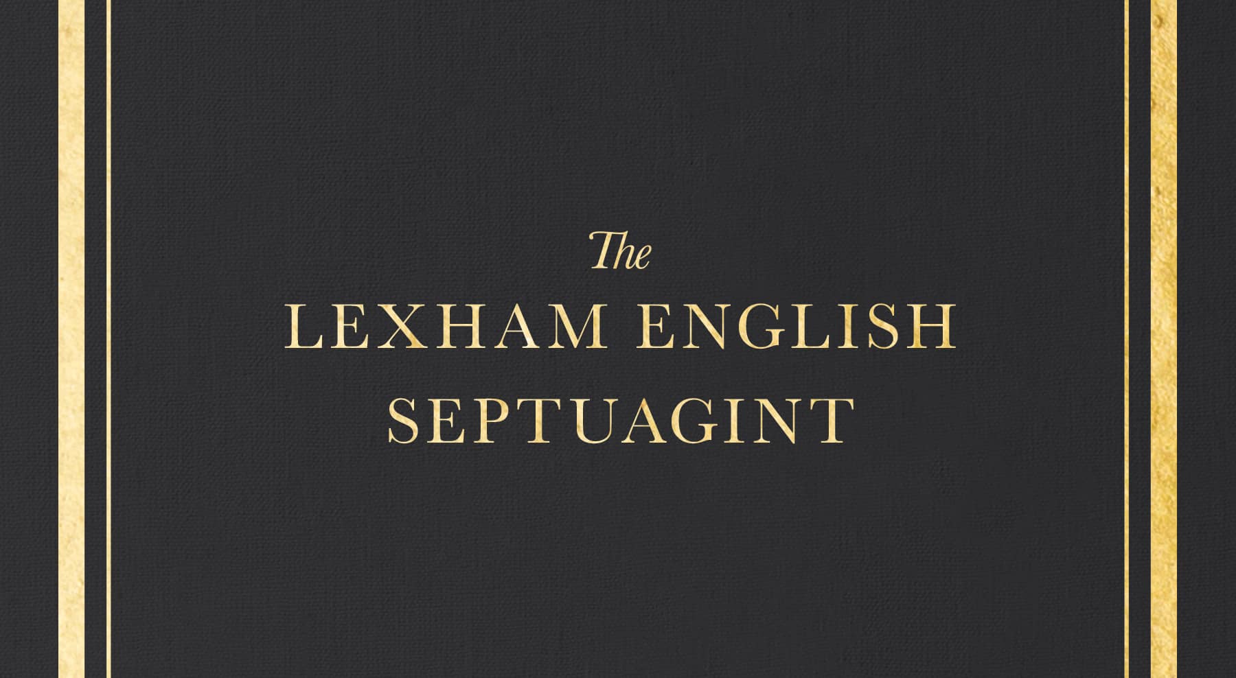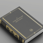
Have you ever wondered what goes into designing a book cover? It’s not an easy process and the final product is the result of a collaboration between designers, editors, and marketers. Here’s a behind-the-scenes look at how we created the cover for the brand new Lexham English Septuagint (LES).
The first step is an initial meeting between the designer, the editor, and the marketing team to get a feel for the cover direction. For the LES, we wanted the cover to be distinctive and authoritative while still being elegant and beautiful. This is what one of the editors suggested: “Subtle geometric or organic motifs or patterns that convey richness, trustworthiness, and history or tradition might be appropriate.”
After this initial meeting, the designer went to work to create a few initial treatments. Here’s one of the initial drafts:

The most difficult part of the part of the cover to design was the spine. Visually, it was the richest part of cover spread and there were a number of options that were created. Here are a few of the icon and spine treatments that were considered:

After going back and forth to hone the design, a final cover was submitted.

Not only is the cover for the Lexham English Septuagint rich and distinctive, it also fits into the Lexham brand identity with the gold foil on the front cover and spine. This beautiful print edition is typeset in a comfortable, single-column format, and provides a literal, readable, and transparent English edition of the Septuagint for modern readers.


